As our team of graphic designers Hawaii, understanding the art of logo design and its evolution is key to staying competitive. KitKat, the beloved chocolate brand known for its crispy wafers and iconic “Have a break, have a KitKat” slogan, recently embarked on a bold visual transformation. The KitKat logo redesign is much more than a superficial update—it’s a strategic branding move that speaks volumes about the importance of staying relevant in a fast-evolving market.
Why a Logo Redesign Matters

A logo isn’t just a pretty picture—it’s the face of your brand. It’s the visual cue that people associate with your product, values, and reputation. In a world where consumers are bombarded with thousands of brands daily, the importance of having a strong, memorable logo can’t be overstated. According to research, it takes only 7 seconds for a customer to form an impression of your brand. That’s how powerful and immediate visual branding can be.
KitKat’s logo redesign isn’t the first time a brand has chosen to update its look to stay current. But in KitKat’s case, the transformation is a blend of honoring its rich legacy while also embracing contemporary design.
The Evolution of KitKat’s Logo

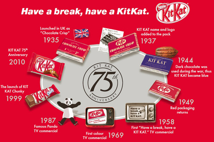
KitKat has been a global favorite for decades, and part of its appeal is the sense of comfort and consistency it provides. But as the market changes, so must the brand. In the early years, KitKat’s logo was simple, consisting mainly of text in a straightforward font. Over time, the brand adopted its now-iconic red background and bold white font, which became instantly recognizable.
However, consumer tastes and preferences evolve, and staying static can be detrimental to even the most iconic brands. KitKat understood that it needed to refresh its image while keeping its core elements intact—enter the logo redesign.
Breaking Down KitKat’s Logo Redesign

KitKat’s recent redesign might seem subtle at first glance, but it’s packed with meaning. The changes were minimal yet impactful, balancing modern design principles with classic elements that fans still recognize. At branding aloha, graphic designers Hawaii are capable of turning your brand’s logo into reality. Let’s break it down the brand stand out on both digital and physical platforms.
- Sleeker Typography: The font used in KitKat’s new logo is sleeker, with rounded edges and a cleaner look. This modern touch gives the brand a more contemporary feel without straying too far from its original design. The smoother curves make the logo easier on the eyes, aligning with the minimalist design trends we see across industries.
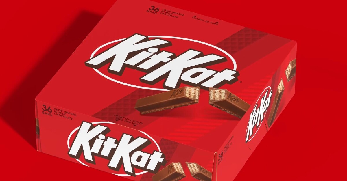
- Refined Colors: The red and white color scheme remains central to KitKat’s identity. However, the new logo incorporates a more vibrant red, which feels fresh and energetic. Red is an appetite stimulant (which works perfectly for a food brand), but the updated hue feels more modern and sophisticated. The white has been crisped up, offering stronger contrast, which makes the logo pop even more.
- Simplified Logo Shape: KitKat’s original logo had a somewhat bulky, oblong shape around the text. The redesign has made this outline slimmer, giving the logo a cleaner, more streamlined appearance. This minimalistic adjustment helps the brand stand out on both digital and physical platforms.
Why KitKat’s Redesign Works
KitKat’s logo redesign works because it follows several key principles of successful brand evolution:
- It Maintains Brand Recognition: The most crucial element of any logo redesign is ensuring that the brand remains recognizable. KitKat achieved this by keeping its core color palette and general layout. Fans of the brand can instantly identify it, meaning there’s no confusion during the transition.
- It Adapts to Modern Trends: Consumers today appreciate clean, simple designs. By streamlining the logo and updating the typography, KitKat embraces these modern preferences without losing its signature look. The new design feels fresher and more suited to both digital and physical spaces, which is essential in today’s omnichannel world.
- It Honors Brand Heritage: Some brands, in their eagerness to innovate, completely abandon their historical branding elements. KitKat took a more balanced approach by modernizing its logo while maintaining its core elements. This respect for brand heritage fosters a sense of trust and loyalty among long-term customers.
Lessons for Brands Considering a Redesign
- Don’t Overcomplicate It: KitKat’s redesign shows that you don’t need to reinvent the wheel. Sometimes, small tweaks—like adjusting the font or refining colors—can make a big difference without alienating your existing audience. A logo redesign doesn’t have to be drastic to be effective.
- Stay True to Your Core: Consumers connect with the authenticity of a brand. KitKat didn’t abandon its iconic elements in pursuit of something trendy. Instead, they found a way to modernize while staying true to their roots. This balance between innovation and tradition is key for a successful logo redesign.
- Think About Versatility: In today’s world, your logo needs to work across multiple platforms. From website icons to packaging, KitKat’s new design is simple and versatile, making it easy to scale across both digital and physical environments.
- Test and Iterate: Logo redesigns shouldn’t be rushed. KitKat likely went through multiple iterations and testing phases before arriving at their final design. Before launching a new logo, gather feedback from both internal teams and external audiences. This process will help ensure your redesign resonates with your target market.
Final Thoughts on KitKat’s Logo Redesign
KitKat’s logo redesign isn’t just about aesthetics—it’s a masterclass in strategic branding. The company understood the need for change but handled the transition carefully, ensuring it stayed true to its core identity while adapting to the modern market.
Whether you’re a small startup or an established brand like branding aloha’s graphic designers hawaii, there’s a lot to learn from KitKat’s approach to redesign. A well-executed logo redesign can breathe new life into your brand, attract new customers, and build stronger connections with your existing audience.
As we’ve seen with KitKat, the key lies in finding that sweet spot between innovation and tradition. Make sure you don’t stray too far from your core values, but don’t be afraid to embrace change. After all, even the most beloved brands need to evolve.
Wrapping Up
KitKat’s new logo redesign is more than just an update—it’s a carefully considered evolution that bridges the gap between the past and the future. For any business considering a logo revamp, KitKat’s approach serves as an inspiration. Keep it simple, respect your heritage, and ensure your logo is future-proof. With those steps, your brand can enjoy a successful, lasting transformation.


